The Need for Clarity in EdTech
Modern Learning Management Systems (LMS) are often plagued by feature bloat, complex nested menus, and overwhelming data density. This creates a stressful environment for students who simply want to access their coursework. When conceptualizing EduMate, our primary goal was radical simplification. We wanted to build a student portal that felt as smooth and intuitive as a high-end consumer SaaS product.
A Serene Visual Language
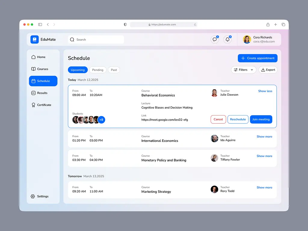
The visual foundation of EduMate relies on a calming, light-themed aesthetic. We utilized a soft, iridescent pink-to-blue background gradient that completely eliminates the sterile, corporate feel of traditional school software. The UI elements float elegantly on pure white cards with soft drop shadows, utilizing a vibrant blue accent color (#0055FF) specifically for primary actions like active tabs and primary buttons, ensuring the user's eye is always drawn to what matters most.
The Scheduling Masterpiece
The core of this showcase is the Schedule module. We abandoned the traditional, rigid calendar grid in favor of a sleek, chronological feed of upcoming classes. For example, a student can easily see their 9:00 AM "Behavioral Economics" lecture with Professor Julie Dawson. The class cards are rich with context: displaying avatars of fellow enrolled students, providing direct meeting links, and offering immediate action buttons to "Cancel", "Reschedule", or "Join meeting".
Intuitive Navigation & Sidebar Architecture
The left-hand sidebar was heavily optimized for mental ergonomics. By using rounded, active states for the current page (Schedule) and clear, legible icons for core areas (Home, Courses, Results, Certificate), a student can navigate the entire platform without a second thought. The top navigation elegantly handles search and notifications, keeping the header remarkably clean.
Conclusion
EduMate proves that educational software doesn't have to be clinical or confusing. By applying the principles of minimalist design, ample whitespace, and focused typography, we created an ecosystem where learning becomes a stress-free, engaging experience.